The 60-30-10 rule is a cornerstone principle in interior design, offering a simple yet effective framework for creating visually balanced and harmonious spaces. It’s a guideline, not a rigid law, but understanding and applying it can significantly elevate your decorating efforts. This rule helps you to select and distribute colors within a room in a way that is pleasing to the eye, creating depth, interest, and a cohesive overall look.
At its core, the 60-30-10 rule is about proportion and color balance. It suggests that 60% of your room should be dominated by a main color, 30% by a secondary color, and 10% by an accent color. This breakdown ensures that no single color overwhelms the space, while also preventing the room from feeling monotonous or bland. Learning how to effectively utilize this principle is a valuable skill for both amateur and professional decorators.
This guide will break down each component of the 60-30-10 rule, providing practical tips and real-world considerations to help you implement it successfully in your own home. We'll explore color selection, texture integration, and how to adapt the rule to suit your personal style and preferences. Understanding the nuances of this rule will empower you to create stunning and well-balanced interiors.
Step 1: Understanding the 60% - Your Dominant Color
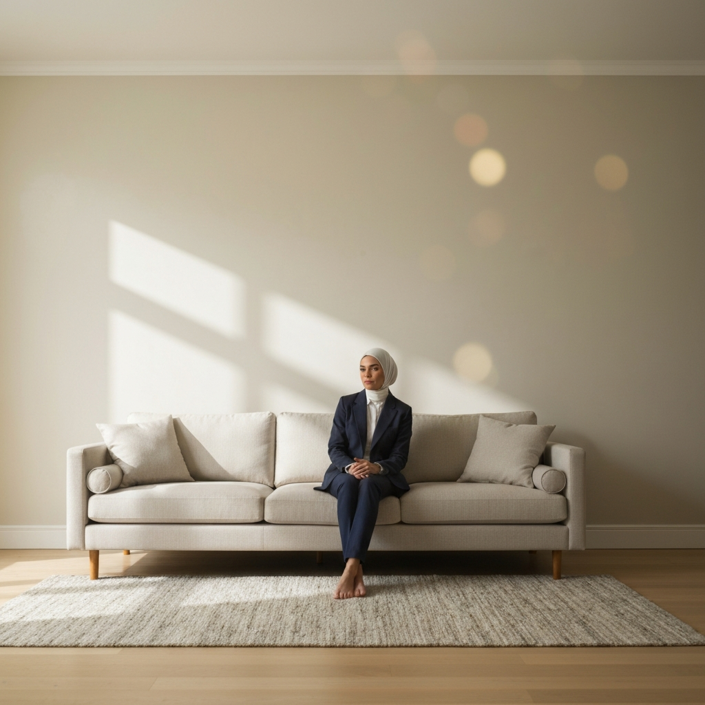
The 60% portion of the rule represents the dominant color in your space. This color should be used for the largest surfaces in the room, such as walls, large area rugs, or a substantial sofa. Choosing a neutral or calming color for this portion is generally recommended, as it sets the overall tone and provides a backdrop for the other colors to shine. Consider the natural light in your room when selecting this color, as it can drastically alter how it appears. A cool-toned gray, for example, might feel cold in a north-facing room with limited sunlight, whereas a warm beige could bring warmth and light to the same space.
Step 2: Incorporating the 30% - Your Secondary Color
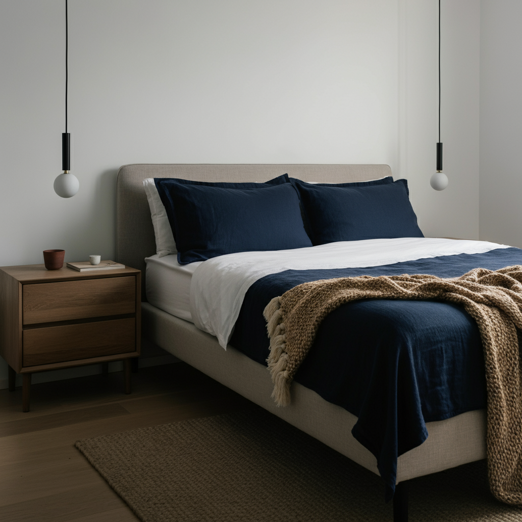
The 30% portion is your secondary color, and it should complement the dominant color while adding visual interest. This color is often used on curtains, accent chairs, bedding, or a painted feature wall. Think of this as a supporting role: it shouldn't compete with the dominant color, but rather enhance it. Consider using a slightly bolder hue or a different texture than your dominant color to create contrast and depth. For example, if your 60% is a light gray wall, you might introduce navy blue curtains or upholstered accent chairs.
Step 3: Adding the 10% - Your Accent Color
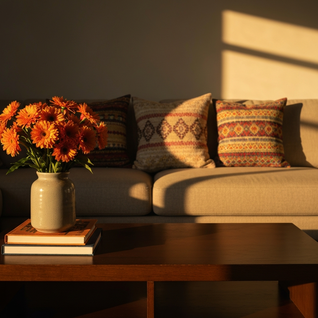
The 10% is your accent color, and this is where you can really inject personality and energy into the room. This color should be used sparingly, in small doses, through accessories such as throw pillows, artwork, lamps, or decorative objects. This is your opportunity to use a bold or unexpected color that might be overwhelming if used in larger quantities. Think of it as the "jewelry" of your room – the final touch that ties everything together. For example, if your room is primarily neutral with blue accents, you might add pops of yellow or coral as your 10%.
Step 4: Adapting the Rule for Different Styles
While the 60-30-10 rule is a helpful guideline, it's important to adapt it to your personal style and the specific characteristics of your space. For example, in a minimalist room, you might opt for a monochromatic palette with subtle variations in texture and tone. In a more maximalist space, you might choose to bend the rules slightly, perhaps using two accent colors instead of one. The key is to maintain a sense of balance and cohesion, even when experimenting with different styles.
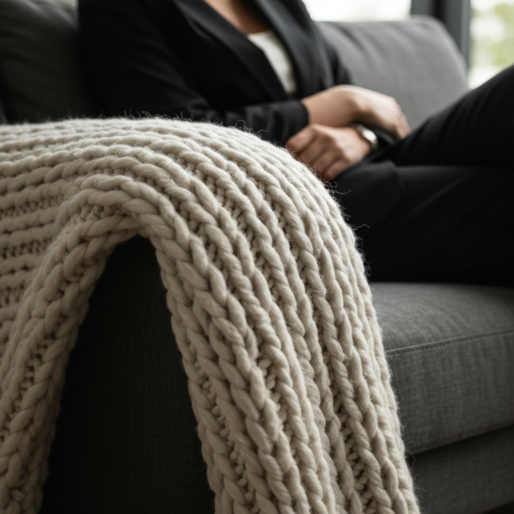
Step 5: Considering Texture and Pattern
The 60-30-10 rule primarily focuses on color, but texture and pattern also play a crucial role in creating a well-designed space. Consider incorporating different textures, such as velvet, linen, wool, or wood, to add depth and interest to your room. Patterns can also be used effectively, but it's important to use them sparingly and thoughtfully. A general rule of thumb is to choose one dominant pattern and use it in moderation, pairing it with solid colors or subtle textures.
Common Mistakes to Avoid
- Ignoring Natural Light: Always consider how natural light will affect your color choices.
- Choosing Colors Based on Trends Alone: Select colors that you love and that will stand the test of time.
- Forgetting About Texture: Texture is just as important as color in creating a visually appealing space.
- Being Too Literal: The 60-30-10 rule is a guideline, not a strict formula. Feel free to adapt it to suit your needs and preferences.
Pro Tips
- Use a color wheel to help you select complementary colors.
- Gather inspiration from magazines, websites, and showrooms.
- Test paint colors in your room before committing to a full paint job.
- Don't be afraid to experiment and have fun!
FAQ Section
- Can I use more than three colors?
- Yes, but it's important to maintain a sense of balance. Consider using variations of your main colors or introducing additional accent colors in very small doses.
- What if I prefer a monochromatic color scheme?
- The 60-30-10 rule can still be applied in a monochromatic scheme by using different shades and textures of the same color.
- Does this rule apply to all rooms?
- Yes, the 60-30-10 rule can be applied to any room in your home, but you may need to adapt it slightly depending on the size and function of the space.
Conclusion
The 60-30-10 rule is a valuable tool for creating harmonious and visually appealing interiors. By understanding and applying this principle, you can confidently select and distribute colors within a room to achieve a balanced and cohesive look. Remember to consider your personal style, the characteristics of your space, and the importance of texture and pattern. With a little practice and experimentation, you'll be able to master the art of color balance and create stunning interiors that reflect your unique personality and taste.